Why does HELIO use the "px" unit?
Why do I need to care about pixels?
First of all, whenever possible, HELIO tries to hide exact values from you since setting them can be a hassle. However, specifying the dimensions of an image or illustration can sometimes be necessary in order to improve performance or simplify layout logic.
In certain situations, HELIO may require you to input numeric values in px,
such as when specifying a minimum width for an element.
What exactly does the HELIO mean when it tells me to specify a dimension using "px" unit?
HELIO is built using web technologies such as HTML, CSS, and JavaScript. So
naturally CSS is used to style and size elements. One important unit of
measurement in CSS is the px – also known as the CSS pixel.
Wait, don’t skip this section – there is one important fact you SHOULD know about CSS pixels: they are density independent, meaning they should not be affected by different screen resolutions.
Yes, you heard it right. According to the official CSS specification (https://www.w3.org/TR/css-values-3/#absolute-lengths), 96 resolution-independent CSS pixels are approximately equal to one inch. Hence, any hardware manufacturer that aims to build a smartphone capable of beautifully rendering all your favorite websites must follow this rule.
So this means that…
1 CSS pixel ≈ 0.026 cm
1 CSS pixel ≈ 0.265 mm
1 CSS pixel ≈ 0.010 inches
Wait, I have been told that using CSS pixels is a bad habit, many times!
😔 Religious battles have raged around this issue for decades. If you don't have the time to read all the blog posts that mankind has produced in a very short period of time (which we assume you don't), just believe us when we say that even the official CSS specifications says that…
»For reading at arm’s length, 1px thus corresponds to about 0.26 mm (1/96 inch).«
– https://www.w3.org/TR/css-values-3/#absolute-lengths
It’s okay!
What Exactly Is the Pixel Ratio?
Pixel ratio in web design refers to the ratio between the physical size of a pixel on a device and the CSS pixel used in web design. It can be found by dividing the physical pixel dimensions by the CSS pixel dimensions. There are various online resources available to look up pixel ratios for common devices.
How Do I Find Out the Pixel Ratio of My Device?
Open the site https://www.mydevice.io/ in the browser of your target device. The calculated values include the pixel ratio.
Tip: In lots of cases it is not possible to view this page on your target device.
For example…
- You don’t have direct access to your panel.
- You are designing an HMI that will be used on tablets that you don’t have available in your office.
Again, you can use https://www.mydevice.io to see the pixel ratios of common devices. Most are between 1.0 and 4.0. There are many alternative sites that can be used for this kind of research, such as https://www.mydevice.io/.
How to Size & Export Images for HELIO HMIs?
This can be an overwhelming task. So we should stick to simple heuristics when dealing with complex situations. So here is one for choosing the right format and dimensions:
If you can use SVG, use it.
Define the size of your image using device independent pixels (aka CSS pixels).
Design your image using your preferred tool and export it using the same independent dimensions.
Be happy!
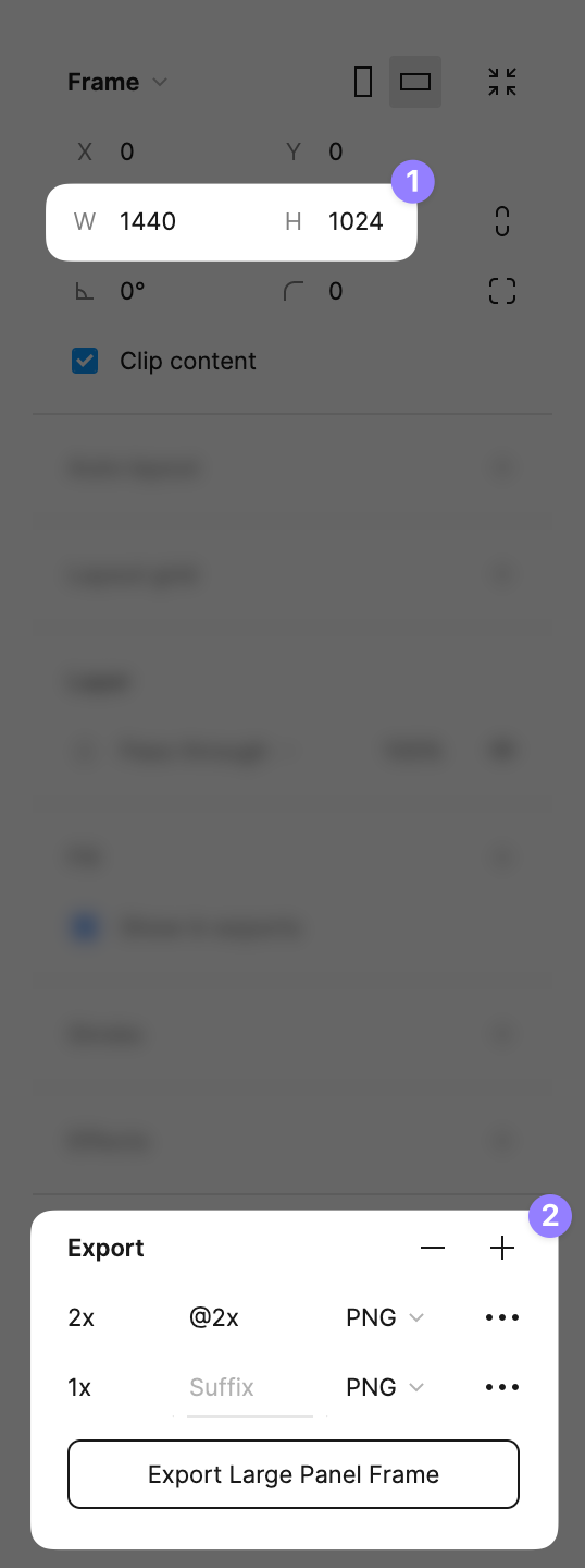
If you cannot use SVGs, use bitmap images at 2x scale, use graphic tools like Figma, etc. to generate them easily. Let's look at an example of how to achieve this in Figma...
Define the size of your image using device independent pixels (aka CSS pixels). In this particular case the actual hardware pixel width of your panel will be 2.880 hardware pixels. However the browser running on this device will measure this exact physical length using 1440 resolution independent CSS pixels.
Export an image with 2x scale. This will generate a sharp image with a width of 2880 pixels and a height of 2048 hardware pixels.
Upload it to HELIO.
When asked for one of its dimensions, provide the device-independent CSS pixels you defined in step 1.
If your HMI runs on a relatively old panel with a device pixel ratio of 1, and it won’t replaced in the next 5-10 years.
→ Just do what you always did and use CSS independent pixel.
A Simple Example
Suppose you want to include a graphic in an HMI that will be viewed on three different devices with different pixel ratios. On your low-end device, this takes up 250 device-independent CSS pixels. To ensure that the images appear sharp, you will need to export two different scales of your image as well:
| Device Pixel Ratio | Results in | On such a device, an <img> tag with a CSS width of 250 pixels, will look best when the source image is... |
|---|---|---|
| 1 | 1 device pixel = 1 CSS pixel | 250 pixels wide |
| 2 | 2 device pixel = 1 CSS pixel | 500 pixels wide |
| 3 | 3 device pixel = 1 CSS pixel | 750 pixels wide |
Usually when designing HMIs it’s easier to simplify this situation and simply export for the largest Device Pixel Ratio and scale down the image on the lower end devices.
Sources & Resources
Articles around CSS pixels and images:
