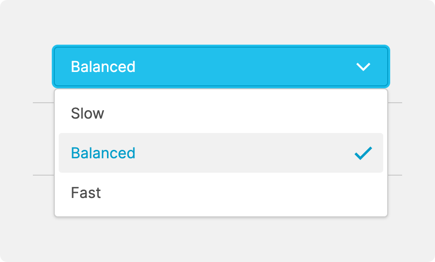
Dropdown (From Enumeration)
About
Use a dropdown if you want to provide operators with a list of options to choose from.
To generate this list, the data variable linked to this element must have certain properties set, most importantly the Enumerations.
Properties
General
Provides context and information to operators, guiding them and helping them understand the value of this particular element. A good label instills confidence in operators when making adjustments.
This icon will be displayed next to the element's label on pages that support it, like the Dashboard Page. An Element can make use of the icon to...
- provide more meaning
- and improve recognition.
The current value that should be displayed on the element, usually this will be bound to a
Data Variable.Control Type
Effortlessly switch between a dropdown, a radio group, or a button group.
Is disabled
Use this property to disable the element in certain situations, such as when your PLC is in a state where manipulation should not be possible.
Appearance
Proportions
Whenever a Page Type permits, you can decide if the element should display in its default manner, typically in one line, or if it should occupy more space by displaying its Label and Icon more prominently in "Spacious" mode.
Description
Wll be displayed underneath the element in “Spacious” mode. This helps to provide additional guidance or instructions to operators when manipulating the input. It's an opportunity to provide more detailed context regarding the potential impact of changes, or further instructions on the desired input format.
Options
By default, the Enumeration linked to the value provides all option labels.
However, you can overwrite the options to set a page-specific label or add an
icon for each option.
Display Condition
Determines whether an element or page should be visible or hidden to the current user. The condition can be set to different List of Dynamic Property Types – as long as the the type returns
true or false you’re good to go.
