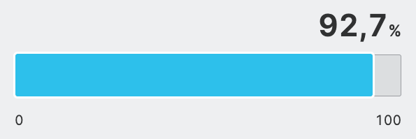
Progress Bar
About
Element Properties
General
Provides context and information to operators, guiding them and helping them understand the value of this particular element. A good label instills confidence in operators when making adjustments.
This icon will be displayed next to the element's label on pages that support it, like the Dashboard Page. An Element can make use of the icon to...
- provide more meaning
- and improve recognition.
Apply Status
From Value with Ranges
If the displayed value includes a status, you can use the "Apply Status From Value with Ranges" option to visually indicate the value’s status as either "Good", "Warning", "Critical" or "Accent".
Manually
Determine manually which status should be displayed by the element.
Display Condition
Determines whether an element or page should be visible or hidden to the current user. The condition can be set to different List of Dynamic Property Types – as long as the the type returns
true or false you’re good to go.Specific Properties
Appearance
Display value as
Choose to display the value as either as Percentage or as an Absolute value.
Place value
Decide whether to place the value inside the Progress Bar or above it.
