Collection Page
Purpose: Streamline access to a large list of items and enable their editing.
About
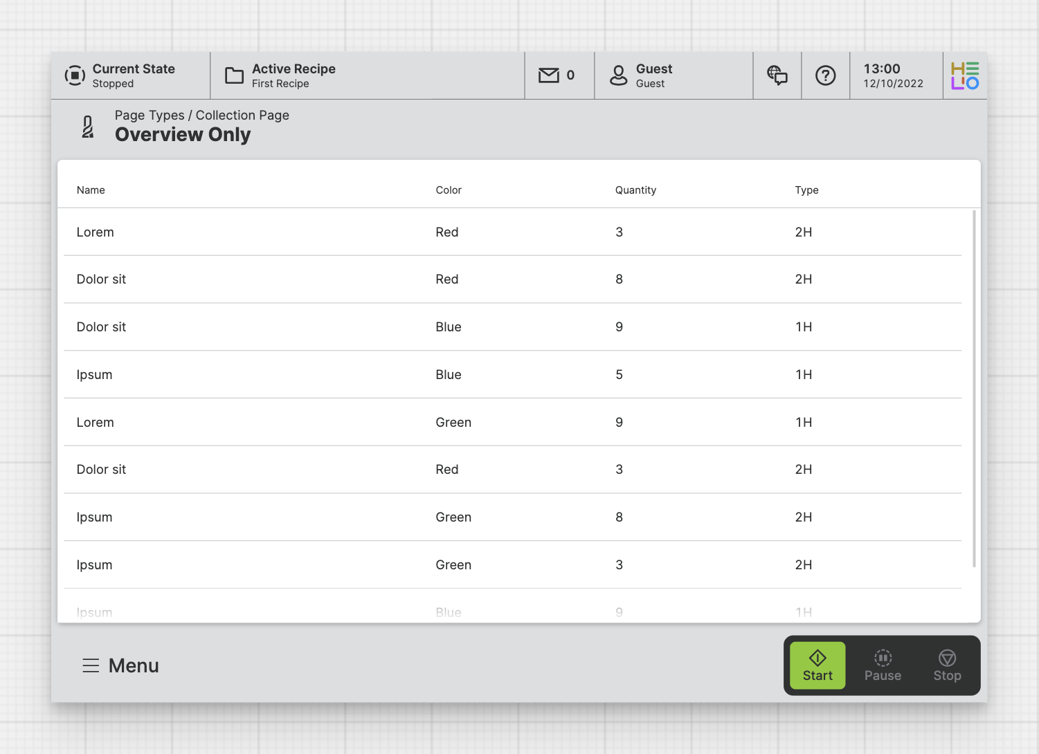
A Collection Page allows you to visualize a List
of items. By default, it is rendered as a vertically scrollable table. You can
choose which properties from the linked Data Source blueprint will be
displayed on this overview page.
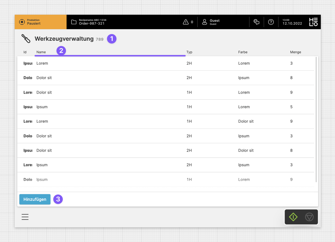
Anatomy
Title and Icon
Property
Footer
Page Properties
General
Title
Page Reference
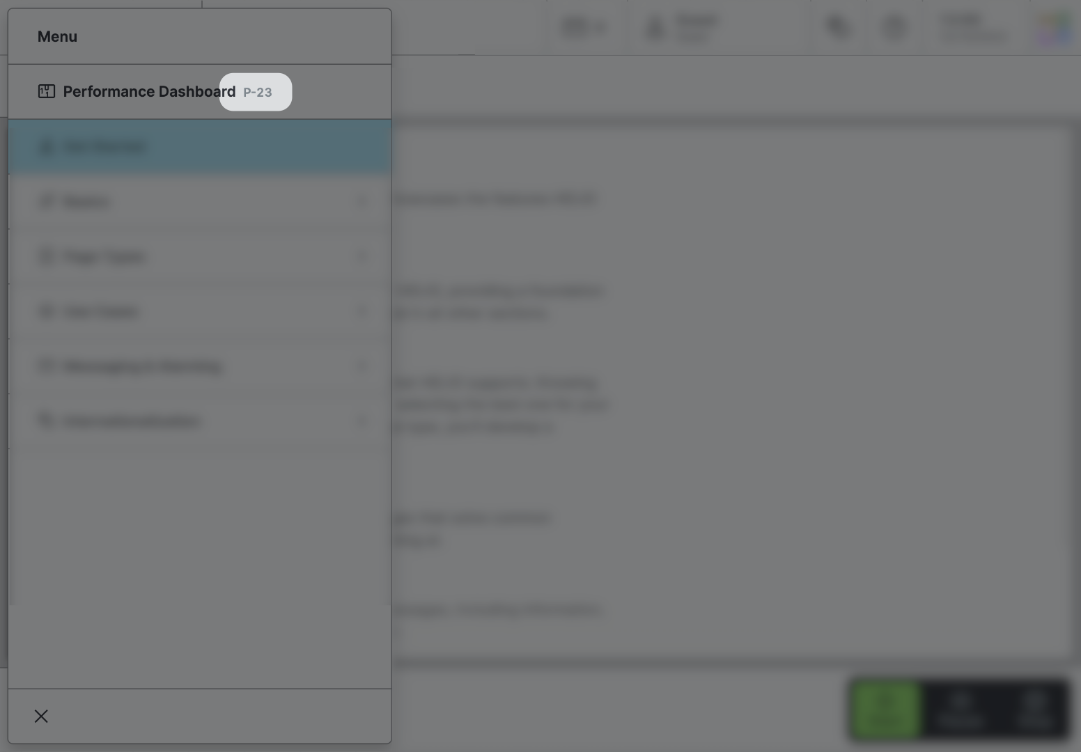
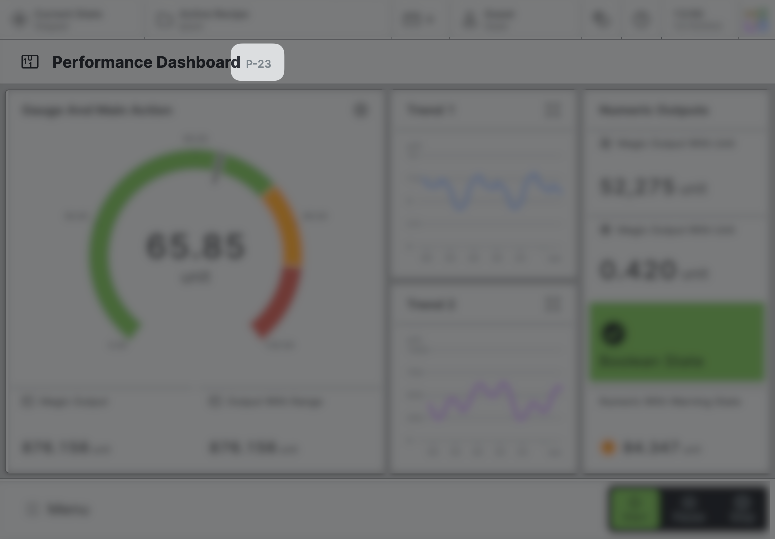
This optional property lets you define unique short code that is human readable and helps to refer to that page without specifying its actual name. This is helpful especially in multilingual environments because
- It helps your Support-Team to quickly navigate users.
- It can be picked up by the product manual and documentation.
Icon
This icon will be displayed in the main navigation, the page header, and inside an embedded navigation of a Page Group.
Navigation
Display this page in navigation
Specific Properties
Data Source
List
Choose the List to be displayed on the Collection Page.
Detail View
Type
Select whether the Detail View should be displayed in the center of the screen or on the right hand side.
Size
Select how large the Detail View should be. Choose between Full, Medium and Small.
Filters
Add filters controls to the top bar of the page.
Slots
Properties
Choose which properties of the list you actually would like to show.
Child Elements
Detail
The Detail slot determines the page that should be displayed when an item has been selected.
Child Elements
Footer
Allows you to add action buttons to the footer, which will always be visible at the bottom of the page. Use this feature for significant actions that can be triggered on this page. It's perfect for the most important actions you can execute on a page.
Bear in mind that the footer does take up a bit of vertical screen space, something to think about if you're creating HMIs mostly for smaller screen sizes.
Child Elements
Related
Content


